The quick answer: Recto Korean fashion brand is best understood through the latest confirmed evidence, practical trade-offs, and the details most likely to change.
Table of contents

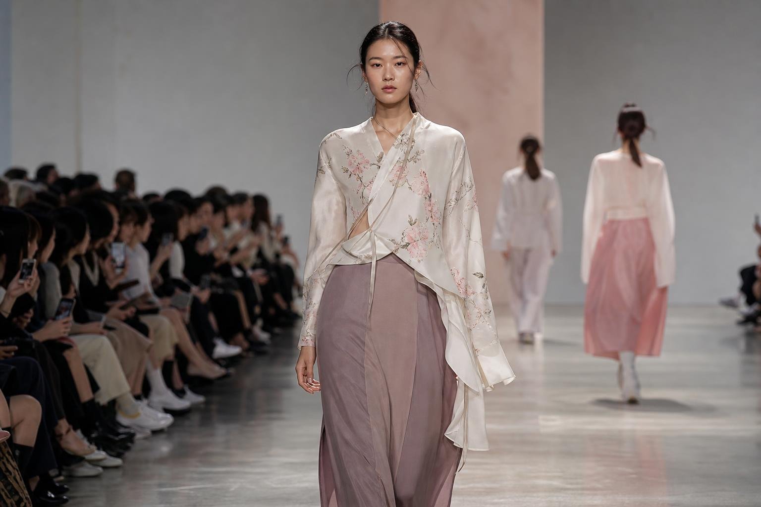
Recto is a South Korean designer label founded by Ji Yeon Jung, known in current international fashion coverage for a refined, minimalist-inspired approach to modern elegance and functionality. For someone who has encountered only the word “recto,” that distinction matters: this is not a publishing term or a generic fashion concept, but a specific Korean brand whose appeal lies in controlled proportion, polish and an approach to dressing that does not depend on overt decoration.
RUSSH, in its March 2026 survey of Korean fashion brands, identifies Jung as an award-winning designer and describes Recto as a South Korean label redefining modern elegance and functionality through minimalist-inspired design. Highsnobiety, in a July 2026 Korean-brand roundup, similarly calls its clothing “perfectly refined” and highlights the label’s exploration of androgynous design. Those descriptions offer a more useful starting point than treating minimalism as a synonym for plain basics.
What defines the Recto Korean fashion brand
Recto’s reported vocabulary has four closely related parts: refinement, modern elegance, functionality and androgyny. Each word changes how the clothes can be read. Refinement suggests a finish that is intentional rather than merely casual. Modern elegance places the brand closer to composed city dressing than to nostalgic or aggressively trend-led styling. Functionality points to clothes meant to operate in a wardrobe, rather than exist only as image-making pieces. Androgynous design opens up room around conventional gender coding in cut and attitude.
That combination is why the label may appeal to people who want an outfit to look considered without feeling ceremonious. The effect suggested by the coverage is not maximalist drama. It is the visual clarity that comes from editing: allowing line, fit and the relationship between garments to carry more of the look than visible branding or novelty detail would.
There is a useful difference between a minimalist garment and a minimalist look. A garment can be simple in isolation yet feel flat when it has no tension in proportion, texture or styling. A minimalist look can be memorable because one element is deliberately enlarged, lengthened, shortened, sharpened or softened against another. In Recto’s case, the source descriptions do not verify specific recurring garments or collection-by-collection signatures. They do, however, make it reasonable to understand the brand’s refinement as an overall design position: restraint with purpose, rather than absence of ideas.
How to read its silhouette without mistaking restraint for sameness

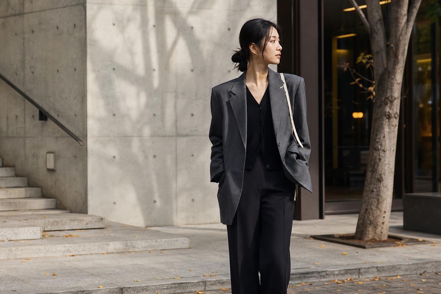
For a shopper or style observer, the most helpful way to approach Recto is through silhouette before colour or trend. Androgynous design is often reduced to the idea of simply wearing oversized tailoring. That is too narrow. It can also be expressed through an unforced shoulder line, a straighter vertical fall, a balance between structure and ease, or styling that avoids treating one body type as the default. The point is not to erase personality. It is to make the garment’s form feel less prescriptive.
In practical terms, the strongest interpretation of Recto’s reported design identity is a wardrobe built around clean visual architecture. Think about how a longer layer changes the outline of a shorter one, how a roomier upper half needs a more decisive lower-half line, or how a close fit can look more modern when the surrounding pieces are less constrained. These are proportion questions, not rules tied to gender.
A polished androgynous look usually benefits from one clear decision. If the jacket or shirt has volume, keep the rest of the outfit visually quiet enough that the shape remains legible. If the trousers create movement, avoid adding too many competing focal points above the waist. If the outfit is narrow and pared back, a more substantial shoe or outer layer can prevent it from looking unfinished. This is editorial interpretation of the descriptors used by RUSSH and Highsnobiety, not a claim about a particular Recto item.
That distinction is especially useful online. A runway image, campaign frame or short social-media clip can make an outfit appear effortless while concealing the work of fit, posture and camera angle. In real life, a refined silhouette should still permit sitting, walking, commuting and adding or removing a layer as temperatures change. A compelling photograph is not automatically a useful template for daily dressing.
Why functionality changes the minimalist equation
Functionality is one of the more significant words in RUSSH’s characterization of the label. It makes the brand’s minimalism feel less like an austere visual exercise and more like a proposition about repeat wear. A functional wardrobe does not need to be utilitarian-looking. It needs to offer enough flexibility that a garment earns its place beyond a single styled moment.
For an individual considering this aesthetic, that means assessing clothing in motion and in context. Can a layer work over what you already wear? Does the sleeve, waist or hem create friction with a bag, coat or desk chair? Will the silhouette make sense with the shoes you actually walk in? Does it leave room for a knit layer in a cold Korean winter, or become too warm and close-fitting during Seoul’s humid summer? Those questions are not claims about Recto’s current materials or construction; they are the real-world test for any label positioned around polished functionality.
Climate deserves particular attention because visual minimalism does not guarantee comfort. Dark, dense-looking outfits may be visually appealing but impractical in humid weather if their fabric weight and ventilation are wrong. A light-looking tailored piece may still require careful storage or professional cleaning. Before buying, inspect the product page for fibre composition, lining, care instructions, garment measurements and close images of seams and closures. None of the supplied reporting gives confirmed current prices, fabric specifications, sizing guidance or retail availability, so those details should be checked directly at the point of purchase rather than inferred from editorial descriptions.
Colour, texture and the case for a quieter full look
Minimalist-inspired design is often assumed to mean an all-black wardrobe. The sources do not establish Recto’s current colour palette, and a refined look does not require one. What matters more is colour relationship. Tonal dressing can make different pieces read as one long line; contrast can clarify a waist, hem or shoulder. Muted colour can foreground cut, while a single stronger note can stop an otherwise spare outfit from becoming anonymous.
Texture is similarly important when branding and embellishment are not doing the visual work. A smooth surface beside something dry, brushed, crisp or softly matte can give a restrained outfit depth. But texture also affects maintenance and comfort. Delicate or highly structured materials may look sharp yet demand more care, while easy-care fabrics may better support a functional weekly wardrobe. The right choice depends on how much upkeep the wearer is willing to accept, not on a universal hierarchy of “better” fabric.
Accessories should support the line rather than compete with it. A bag, belt, glasses or shoe can be useful as a punctuation mark, especially where the clothing is reduced to a few strong shapes. The question is scale: a very small accessory can disappear beside a broad silhouette, while an oversized one can turn a composed outfit into a costume. There is no sourced basis to identify a Recto signature bag, shoe, jewellery line or accessory category. The same applies to brand-specific hair and makeup references: the supplied material profiles the clothing’s design language, not a documented beauty direction.
That absence is a precise limitation of the available reporting, not a reason to invent an aesthetic uniform. Anyone translating this mood for themselves can keep hair and makeup aligned with the clothes’ level of finish rather than copying a supposed “Recto face.” A clean grooming choice, a deliberate texture in the hair, or a more expressive lip can all work, provided the overall result feels intentional. The aim is coherence, not endorsement by the brand.
Where Recto may fit in a wardrobe

Recto’s source-described position makes most sense for occasions where polish is useful but excessive formality would feel out of place: a creative-office day, a gallery visit, a dinner where personal style matters, travel with a tightly edited suitcase, or an event that calls for a sharper alternative to standard businesswear. Its language of modern elegance can also appeal to people whose wardrobe sits between casual streetwear and conventional tailoring.
Versatility should be judged by the garments already in your closet. A highly directional silhouette may be a worthwhile statement piece but less adaptable than a layer that works with several trouser, skirt or shoe shapes. Conversely, an understated piece is not automatically versatile if its proportion clashes with everything else you own. Photographing a prospective purchase beside two or three outfits you already wear can reveal more than imagining a complete new wardrobe around it.
Price is also part of wearability, even though the supplied sources do not provide current Recto price points. A higher initial cost can only be assessed against expected frequency of wear, care requirements, fit confidence and the cost per use you consider sensible. Do not assume that a Korean designer label is affordable, inaccessible or identically priced across markets. Currency, retailer markups, shipping, duties and return terms can change the final calculation materially.
Menswear and LIGI: what the reported expansion tells us
Recto is not static in the way a quick brand-list entry can suggest. In its December 31, 2025 review of Korea’s fashion industry, the Samsung Fashion Research Institute reported that the contemporary brand expanded into menswear before launching LIGI, described there as a youth-oriented casual brand.
The sequence matters. It suggests a business developing beyond a single original offering while preserving a distinction between Recto’s contemporary positioning and LIGI’s youth-oriented casual framing. It also gives context to Highsnobiety’s emphasis on androgynous design: a label can investigate less rigid gendered codes without collapsing every category into one interchangeable proposition.
Still, shoppers should not treat that industry report as proof that every current Recto release is unisex, that all menswear remains available, or that LIGI is merely a lower-priced version of Recto. Those are separate questions requiring current official product information. What is confirmed by Samsung Fashion Research Institute’s report is the expansion itself and the later LIGI launch.
A disciplined way to decide if the look is yours
The attraction of Recto’s design language is its apparent calm. Its challenge is that calm can expose poor fit quickly. Without busy pattern or conspicuous detail to distract the eye, a shoulder that pulls, a hem that lands awkwardly or a trouser length that breaks in the wrong place becomes more visible. Start with the proportion that already makes you feel most like yourself: a defined waist, a long vertical line, a relaxed shoulder, a cropped layer, a fuller leg or a closer fit. Then introduce just one contrasting element.
Try the idea with clothing you own before investing in a new label. Combine a structured layer with softer trousers, or a straighter base with a more relaxed top. Wear it for several hours, not only in front of a mirror. Notice where you adjust it, what you avoid doing in it, and whether it still feels right after a coat or bag is added. This approach keeps the focus on comfort and repeatability, which is more faithful to the reported idea of functionality than buying a look wholesale.
Recto’s value, as it emerges from the available coverage, is not a prescribed uniform. It is a Korean designer proposition rooted in thoughtful reduction: refined enough to make an impression, functional enough to invite real use, and androgynous enough to leave room for the wearer to define the final shape.
Sources and verification
- 31 of the best Korean fashion brands to shop in 2026 – RUSSH / Other search result (Mar 17, 2026)
- 27 of the Best Korean Brands in 2026 – Highsnobiety / Other search result (Jul 27, 2026)
- Samsung Fashion Research Institute Releases the Top 10 … – 삼성물산 뉴스룸 / Other search result (Dec 31, 2025)
Frequently Asked Questions
Who founded Recto?
RUSSH identifies Recto as a South Korean fashion label founded by award-winning designer Ji Yeon Jung. Highsnobiety also names Jung in its Korean-brand coverage, describing her work with Recto through refinement and androgynous design rather than through a single seasonal trend.
What is the Recto Korean fashion brand known for?
The Recto Korean fashion brand is characterized in available fashion coverage by modern elegance, functionality, minimalist-inspired design and refined, androgynous clothing. Those are broad design descriptions, not confirmation of particular current products, fabrics, price points or signature accessories.
Has Recto expanded beyond its original label?
Yes. Samsung Fashion Research Institute reported on December 31, 2025 that Recto expanded into menswear and later launched LIGI, a youth-oriented casual brand. The report confirms that expansion, but it does not establish current LIGI pricing, availability or product overlap with Recto.
Explore more K-culture stories
RECOMMENDED SITE
Planning a trip to Korea?
Discover practical Korea travel guides, local tips and destination ideas at KoreaSpot.